

Create Skeleton Loading Animation With CSS and React.js


Animated loading skeleton is an important visual element in web design. It helps users understand an application is busy doing something in the background, which improves the overall user experience of your application.
In this article, we will create a skeleton animation loading indicator with CSS and React.
What are Skeleton Loadings?
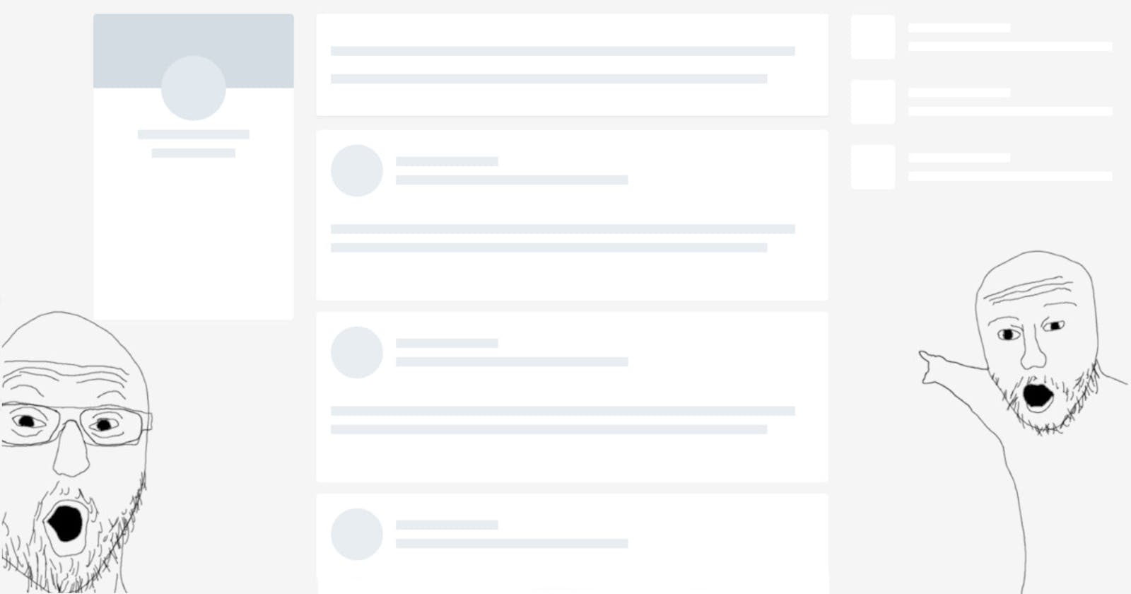
A loading skeleton is a version of the user interface that does not include the actual content, but instead mimics the page layout by displaying elements that are similar to the actual content as it loads.
A skeleton display is essentially a page's wireframe structure with placeholder text and image boxes.
Users will understand how quickly the web or mobile application will load even before the content is displayed because a skeleton UI resembles the actual UI of the page.
Also skeleton screen makes it easier to mimic a page layout because content loads in stages (not all at once).
Setting Up
To create a boilerplate and remove the unwanted files and contents, run 'npx create-react-app'. We will be creating an app that shows a list of posts generated by the jsonplaceholder.typicode.com/posts API.
Cards
Inside the 'src' folder, create the 'Card.js' file. The post details will be displayed using this component.
import React from "react";

export default function Card() {

  return (

    <div className="card">

      <h2>title goes here</h2>

      <p>body goes here</p>

    </div>

  );

}
Skeleton
Create Skeleton.js file inside the src folder :
import React from "react";

export default function Skeleton() {

  return (

    <div className="card skeleton">
      <div className="title text"></div>
      <div className="description text"></div>
      <div className="description text"></div>
      <div className="description text"></div>
      <div className="overlay"></div>

    </div>

  );

}
Styling
Let's add few stylings to the components :
* {

  box-sizing: border-box;

}

body {

  background-color: #f8f9fa;
  display: flex;
  flex-direction: column;
  align-items: center;

}

h1 {

  text-align: center;

}

.card {

  width: 450px;
  margin: 30px;
  padding: 20px;
  min-height: 200px;
  background-color: #fff;
  border-radius: 10px;
  box-shadow: 0px 0px 5px 1px rgba(0, 0, 0, 0.3);

}

h2, p, .title, .description {
  margin: 15px;

}

.text {
  border-radius: 8px;
  background-color: #dee2e6;

}

.title {
  width: 200px;
  height: 20px;

}

.description {
  width: 350px;
  height: 15px;

}
Animation
The Skeleton Screen is only complete with a linear animation, so let's add a few more properties :
.skeleton {

  position: relative;

}

.overlay {

  position: absolute;
  top: 0;
  left: 0;
  width: 20%;
  height: 100%;
  background-color: rgba(256, 256, 256, 0.3);
  box-shadow: 0px 0px 20px 30px rgba(256, 256, 256, 0.2);
  animation: slider 1.2s infinite;

}

@keyframes slider {

  0% {
    transform: translateX(-100%);
  }

  100% {
    transform: translateX(500%);
  }

}
App
Now we are all set with the components. Let's import them in App.js:
import "./styles.css";
import Card from "./Card";
import Skeleton from "./Skeleton";
Let's build Logic to fetch the posts. For this we will need useState and useEffect hooks. So let's import them :
import React, { useState, useEffect } from "react";
We will need a state to store the posts. So initialize an empty array:
const [posts, setPosts] = useState([]);
Also , initialize a boolean state to keep a track on the posts array :
const [isEmpty, setIsEmpty] = useState(true);
The isEmpty variable is set to true initially since the posts array is empty.
Now lets fetch the posts :
useEffect(() => {

    setTimeout(() => {

      fetch("https://jsonplaceholder.typicode.com/posts")

        .then((response) => response.json())

        .then((data) => {

          setPosts(data);

          setIsEmpty(false);

        })

        .catch((err) => console.log(err));

    }, 3000);

 }, []);
A 3 seconds delay is added to show animation progress. The isEmpty variable is updated to false when posts array is populated with data. The useEffect hook is provided with an empty dependency array which corresponds to the componentDidMount life cycle method.
The final part, Let's render the components :
return (

    <>
      <h1>Posts</h1>

      {
        isEmpty && [1, 2, 3, 4].map((value) => <Skeleton key={value} />)
      }

      {
        isEmpty ||
          posts.map((post) => (
            <Card key={post.id} title={post.title} body={post.body} />
          ))
      }
    </>
  );
We render 4 Skeleton Cards if isEmpty is true. Else, we render the posts.
The App.js will look like :
import "./styles.css";
import React, { useState, useEffect } from "react";
import Card from "./Card";
import Skeleton from "./Skeleton";

export default function App() {

  //state to store posts
  //initializing posts as an empty array
  const [posts, setPosts] = useState([]);
  //state to determine whether posts is empty
  const [isEmpty, setIsEmpty] = useState(true);

  useEffect(() => {

    //3s timeout to mimic server delay

    setTimeout(() => {
      fetch("https://jsonplaceholder.typicode.com/posts")
        .then((response) => response.json())
        .then((data) => {
          //populating posts array
          setPosts(data);
          setIsEmpty(false);
        })
        .catch((err) => console.log(err));
    }, 3000);
  }, []);

  return (
    <>
      <h1>Posts</h1>
      {
        // rendering 4 skeleton cards when posts array is empty
        isEmpty && [1, 2, 3, 4].map((value) => <Skeleton key={value} />)
      }
      {
        //rendering actual cards when posts array is populated with some data
        isEmpty ||
          posts.map((post) => (
            <Card key={post.id} title={post.title} body={post.body} />
          ))
      }
    </>
  );
}
A final touch left. Notice that we are passing props to the Card Component? It has to be taken care of. Make the following changes in Card.js.
import React from "react";
export default function Card({ title, body }) {

  return (
    <div className="card">
      <h2>{title}</h2>
      <p>{body}</p>
    </div>
  );

}
And that's all folks !
Conclusion
Hopefully, you found this tutorial to be helpful, and it will serve for you as a good starting point for creating various skeleton loading screens.
I hope you enjoy and happy coding! 🥑💖